✵ Know more ABOUT ME or how I SEE THE WORLD
Artisttio
Client / Artisttio
Industry/ Music, Performing Arts
Project Year / 2021
Origin / Hong Kong
Branding
Artisttio is an art & music intermediary based in Hong Kong. Inspired by the concept of Airbnb, the brand provides art & music services including practice room renting, pairing up learners with teachers, online tutorials, and other art-related experiences. Artisttio not only acts as a service provider but also a long-lasting platform to bind all art enthusiasts and make the art experience more convenient and approachable.
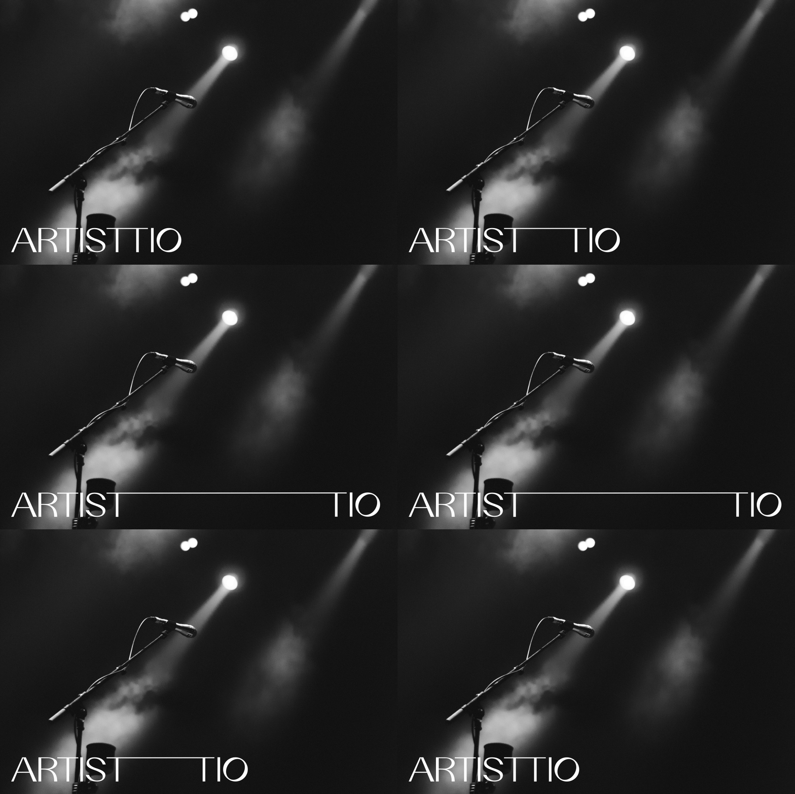
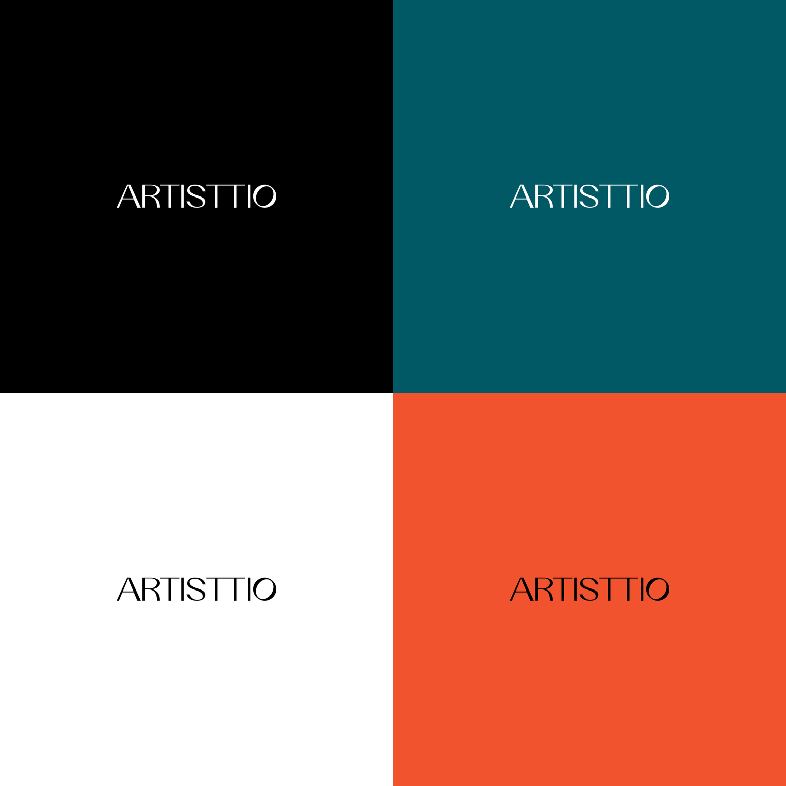
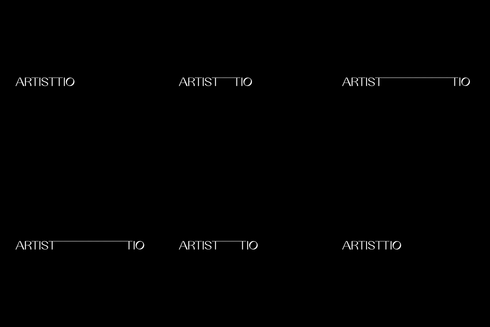
The logo adopts a concise and contemporary typographic approach. Its expandable system visualises the core value of the identity, emphasising the continuous relationship among all users in Artisttio.


The 3 Double T
The visual identity takes inspiration from the bridge, which embodies the idea of connecting and cultivating possibilities from different art and music enthusiasts. The general “TT” symbolises a platform to connect people, with an expandable line to emphasise the sustainable relationship among all users and an extension of art-related knowledge.
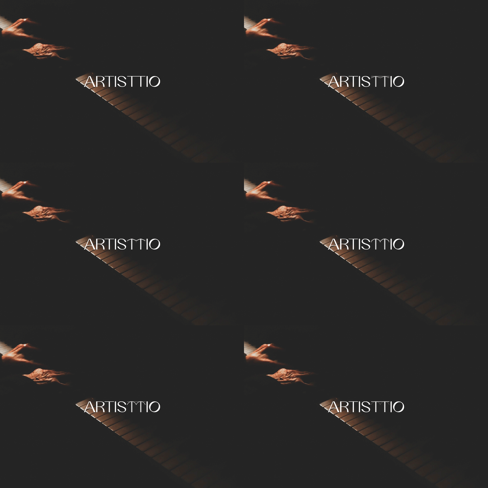
The second “TT” uses arrows as a symbolism of the knowledge providers, while the
third “TT” uses bowls to symbolise knowledge receivers.


